 Conscripter
SVG Creation
SVGs uploaded will only use the flat, solid fill portion of the image. Strokes and gradient fills are not supported.
The viewbox or document width and height will be treated as the 'main area' of the glyph. You can leave these bounds - this is useful to place diacritics with letters, as seen in the Abugida example below.
Font Usage
After downloading the font, you should be able to use it in most advanced word editing programs. WordPad or Notepad will not be able to use it.
Inkscape, Adobe Illustrator, Adobe Photoshop, Adobe InDesign, and Microsoft Publisher should all support it out of the box.
For Microsoft Word, you will need to manually turn on calt support. This is done by opening the fonts menu and checking the calt checkbox.
Tutorials
Use Case: Abugida
Abugidas can be tricky to do even with a full font-editing tool, so let's look at how to accomplish this. The files are located here. Before going any further, load this json, abugida2.json into Conscripter using the Load button. This is the completed font.
Abugida2's orthography is really simple.
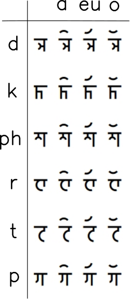
First, we need to create a consistent set of glyphs in our SVG editor of choice.
I'd recommend creating a base.svg or similar that you can base each glyph on, that includes horizontal rules for common areas like the accent mark region and how for down you go.
For each consonant, draw a path. Once the path is completed, use Stroke to Path or similar. In Inkscape this is in Object > Stroke to Path. This is important because we only use the fill portion of the SVG to draw the glyph.
Save each consonant into their own file, keeping a consistent positioning for each.
For each vowel, we need to position the accent mark before the actual glyph. This is done simply by moving the entire glyph to the left of the document.
I'd recommend loading up the example files in your editor to get an idea of how the positioning and layout works, as well as what a flat fill looks like.
Second, we need to add these into Conscripter.
Navigate to the app. Click the "Get Started" button.
Add one of the .svg files you created, set the 'replace' to the characters you'd like it to replace, and set the advance width.
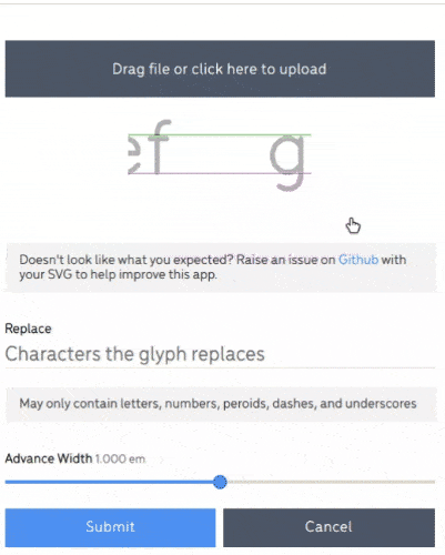
After hitting submit, you can change the version by clicking on the glyph again. You can reorder the glyphs by dragging and dropping or by opening them up.
Order matters, especially in Abugida2 - try uploading the p glyph before the h glyph, and then try typing phadkoreut. Not how the ph looks like a p glyph and then the h character. The most important glyphs should come before the least important glyphs.
Finally, once completed, make sure to name your font, and then hit save to download a copy of everything you've done. This is needed if you want to make changes later. Hit download to download the actual .otf onto your computer.
Install the font on your computer (this is operating system dependent, but most will give you an option to install if you double click to run the .otf). Close all your editing programs, and re-open them - you should see your font in the list of choices available.
Use Case: Syllabry

Syllabries use a single glyph for each syllable. Let's look how to accomplish this. The files are located here. Before going any further, load this json, syllabry1.json into Conscripter using the Load button. This is the completed font.
Syllabry1's orthography is really simple.
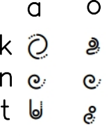
However, it should be noted that Syllabry1 is traditionally written vertically right-to-left, similar to traditional Japanese.
First, we need to create a consistent set of glyphs in our SVG. Unlike with Abugida2, these glyphs do not require any fancy positioning as these glyphs are intended to be stacked on top of each other.
Second, we need to add these into Conscripter. This is much like with Abugida2, however we do not need to modify the advance width. Instead, let's make sure that the preview window contains are latest.
Note that in the BETA only typing at the end of the text is supported: both inline editing and highlighting are not working yet.
Third, name your font and download it. Install it on your machine.
When typing with your font in an editor, it will behave much like a standard horizontal font. To use it vertically your editor needs to support vertical orientation. Illustrator, for example, does. Selecting Text > Orientation > Vertical will turn your text vertically and right to left.
If your editor supports a different way of having vertical fonts, please Create an issue on Github with the name of your editor so I can investigate further.
Made it this far? Have feedback on how to improve these tutorials? Create an issue on Github to help improve the app!